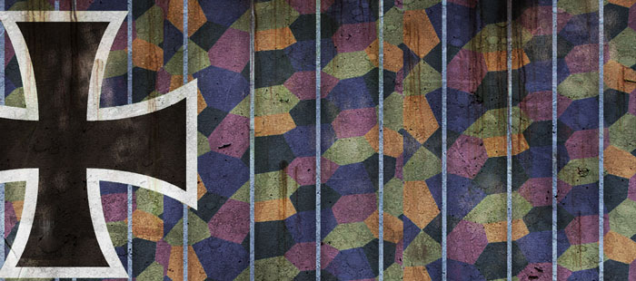
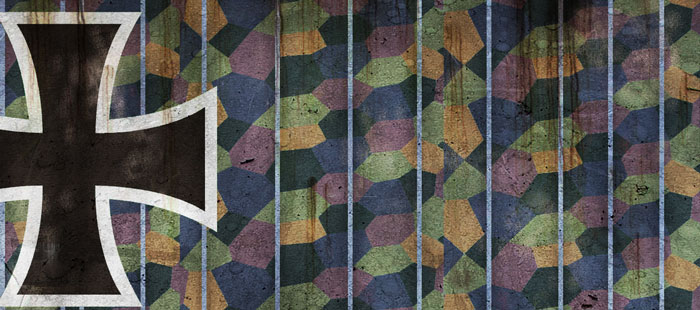
Conclusions - Upper colors
.
Just in case I haven't stressed this
enough already, this is just my opinion. I feel that just about any of the colors
in the Figure at the bottom of the page would be justified. With the exception
of # 7 as I think it is pretty obviously yellowed. I would also put more weight
on the original Munsel colors (labeled # 2 below) but I do not know how valid
the colors are that I have presented here because I processed them through the
on line munsel converter and have no idea how good the translator is. If any
body has a way to validate the results of the converter i would appreciate the
help.
But, based on the evidence available I have made the following two choices for
my own use on my virtual work, and I plan to eliminate the NASM scheme entirely.
1 - The image
on the left is based on color # 5. This is the map I have been using for almost
all the DV/DVa renderings that I produced in the last 9 months or so. I am still
pretty happy with it and feel it is a likely representation of the colors as
they would appear on a new aircraft. I will probably generate a desaturated
version to represent an older machine that had been in the field for some time.
2 - This is a new set of
colors that I have yet to implement into my work that is closest to the colors
# 7 as it is modified by action "A" below.
Essentially I dumped out some red and cut back the saturation a little. I like
this scheme mainly because I question the overall warmth of the first scheme
and would like an alternative.
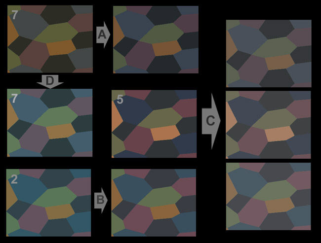
The samples I selected are
numbers 7, 5, and 2; they are labeled below in the upper left hand corner.
Modifications are as follows:
A Color Balance -20, -10, 12 = Cyan > Red....Magenta > green....yellow
< blue
B Color Balance -20, 0, 0 = Cyan > Red
C Hue/Saturation Saturation -25, Lightness +7
D Color Balance -15, +10, +30 = Cyan > Red....Magenta < green....Yellow
< Blue
Brightness/Contrast Brightness +16, Contrast +17
George
Seurat
French Impresionist painter 1859-1891
These two images were taken from the painting "Port-en Bessin" by
Georges Seurat painted in 1888.
Obviously, i have greatly enlarged small sections of the painting.
There is little doubt in my mind that whoever "invented" the lozenge
scheme owed a lot to the works of Seurat.
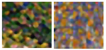
Full painting can be seen at the Minniapolis
Institute of Arts web site:
http://www.artsmia.org/