
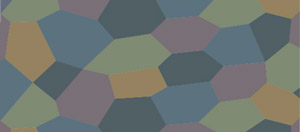
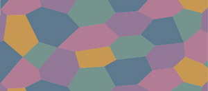
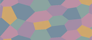
German 5 Color Lozenge
Camouflage Scheme
by Alan Toelle
The brighter palettes were created by adjusting the colors to match authentic original specimens that were in hand. These specimens came from various sources and included more than one example of each color. All of the specimens were in good condition and were either completely free of dope or had the dope peeled off to reveal the base color. All of the specimens were consistent with many other original specimens I have seen.
After creating the palettes, I compared them for general appearance against photographs of very large pieces that retain their original dope. For the upper surface colors, I compared it to an upper wing cross taken from the Hannoveraner brought down near the Very-Cheppy crossroads by Lt. Meyer of the 28th Aero Squadron on 3 October 1918. The original fabric is in the collection of Bob Kasprzack of Dayton, Ohio. I examined the original and have good photographs taken under good lighting conditions. I found that by superimposing a 15%-opacity "lightening" mask, my palette took on the general appearance of the photograph of the Hannoveraner fabric. This simulates the effects of the original aged clear dope on the fabric. The dope on the original fabric is in relatively good condition, is not seriously detached or peeling, and not overly cloudy or discolored.
For the undersurface colors, I compared the completed palette with a photograph I took of the underside of the upper wing of the Halberstadt in the Royal Belgium Army Museum. Although the general condition of this airplane was relatively poor, the undersurface of the upper wing was in quite good condition. The same 15% opacity lightening mask brought my palette into conformity with the photograph.
In both cases, the overall appearance and relative hue, value, and chroma, of my masked palettes were consistent with the photographs. This exercise is intended to validate the basic palettes. However, the basic palettes were created by matching with original specimens in-hand, not photographs. One should use the basic palettes, not the masked versions.
* * * * *
Now, a word about Munsell. The person who set this train in motion was H. D. "Don" Hastings, formerly an electrical engineer with CBS and later to fall victim to Alzheimers. Don started obtaining Munsell data on German printed fabric in the early 1960s. I corresponded with him on nearly a daily basis from 1967 through 1972 while we were studying the French colors. He was a very meticulous, careful, and self-critical researcher. His work was the basic source for much of the information later published in model magazines, etc. However, he rarely receives credit. Some other researchers were doing similar work in England at that time, Peter Gray being one. I think Paul Leaman also did this.
Munsell color charts were
very expensive. It was not feasible for ordinary people to obtain a complete
set. In those days, what we did was to purchase a Munsell Student Handbook of
color. This had a page for each of the basic hues. You had to mount the individual
color chips yourself. Once you were familiar with the basic outline, you augmented
the Student set by
buying individual pages from the Munsell Pocket Handbook of Color. You bought
just the pages that covered the area of research you were conducting. Thus,
I purchased the pages in the yellow range that covered French camouflage. Don
Hastings had to buy a lot more pages to cover the German colors that were all
over the spectrum. In any case, if you were in the field and encountered a color
that was in an area where you did not have coverage, you estimated the Munsell
hue based on experience and judgement. Over time, Hastings and I were able to
collect a considerable number of original specimens that we could examine at
home under better conditions. Around 1970, the Methuen Handbook of color became
available and we started using it. It had very good resolution if the green
colors and pretty good resolution elsewhere. It solved the problem of being
caught in the field without coverage of a certain hue. In any case, the palettes
derived from published Munsell data each have some validity, but, unfortunately,
not across the board, probably because of a missing page in the book.
German printed fabric is usually coated with clear dope and sometimes a coat of varnish, as well. The German dope was of general poor quality and often (but not always) becomes spotty, cloudy, and/or yellowed with age. If varnish is present, it tends to become yellow or orange and may also take on the appearance of an alligator hide. Thus, I don't try to measure colors through a deteriorated coating. If you are looking at a specimen in the field or in a museum, you are not allowed to remove the dope. Again, in some cases the dope is relatively good and still clear, as in the case of the two photographs I used for comparison. However, you can see the difficulty of trying to use photographs as color references when you haven't seen the original and can't judge its condition or all the variables from taking a photograph, developing, printing, scanning, displaying, sampling, etc., It is no wonder that the results can be bizarre or, at best, have a general color shift.
I an not an expert on dye, but I have examined and photographed dozens of original German specimens under the microscope and find that the colors of the dye are very consistent and brilliant in appearance. My photographs were all printed by a professional color laboratory and each roll calibrated to an 18% gray card. I don't see any color shift or fading of the dye. The variations in overall color are due to the difficulty of getting the dye to adhere to the linen fabric. There is noticeable variation in the degree to which the dye saturates the fabric. This does not change the color but makes it appear overall more or less neutral, within a range. The color of the dye is the same but the quantity on the fabric varies a bit. The color of the dye stays the same even though the overlying dope, and sometimes varnish, have discolored or become loose. When matching colors, I remove a small portion of the protective coating from the fabric. The dope usually peels right off without affecting the fabric. The dope was not supposed to saturate the fabric but to coat the surface.
Replica fabrics vary a lot. The NASM Albatross was the first attempt and the results were far from ideal. I have a piece of the replica fabric and you definitely would not want to use that as a reference for any of the colors. I saw some fabric made in Germany that was much better. If one is trying to reproduce these colors, one should try to match original specimens. If you try to match reproductions, then you have a 50% chance of producing a color that is farther from the original than the reproduction. You quickly find yourself with a palette that has one or two colors off in hue and that doesn't have a plausible balance between the colors, and therefore doesn't look right. A good photograph is very useful for checking color balance.
Best regards,
Alan Toelle